AI image generation is closer to directing a scene than writing a prompt
I tried AgnesAI after watching the demo at E27 Echelon. Here is what made the difference between images that looked AI-generated and ones that held together.
Yesterday at E27 Echelon, the AgnesAI team ran a live demo. I watched from the audience and immediately wanted to try it.
The first images I generated looked exactly like what people complain about when they say AI-generated.
Too loud. Too artificial. Humans with visible defects. Fake text screaming from screens and sticky notes. Every image announcing itself as AI.
That was with direct generation. Describe a subject, get an image. It is the obvious first approach, and it produced the obvious result.
What changed when I tried a different workflow
Later that day, I generated a version of the same concept with Codex assisting the direction. The output felt noticeably more grounded. Not perfect, but believable.
That made me ask a different question. Was the difference in the model, or in how I was directing the image?
Before generating, I asked Claude to give me five possible scenes. Not prompts. Scenes.
Each one described:
- The actual setting, not just the topic
- Camera angle
- Lighting
- Mood
- Specific objects that should appear
- What should stay in focus
- What should be avoided entirely
- Whether humans should appear at all
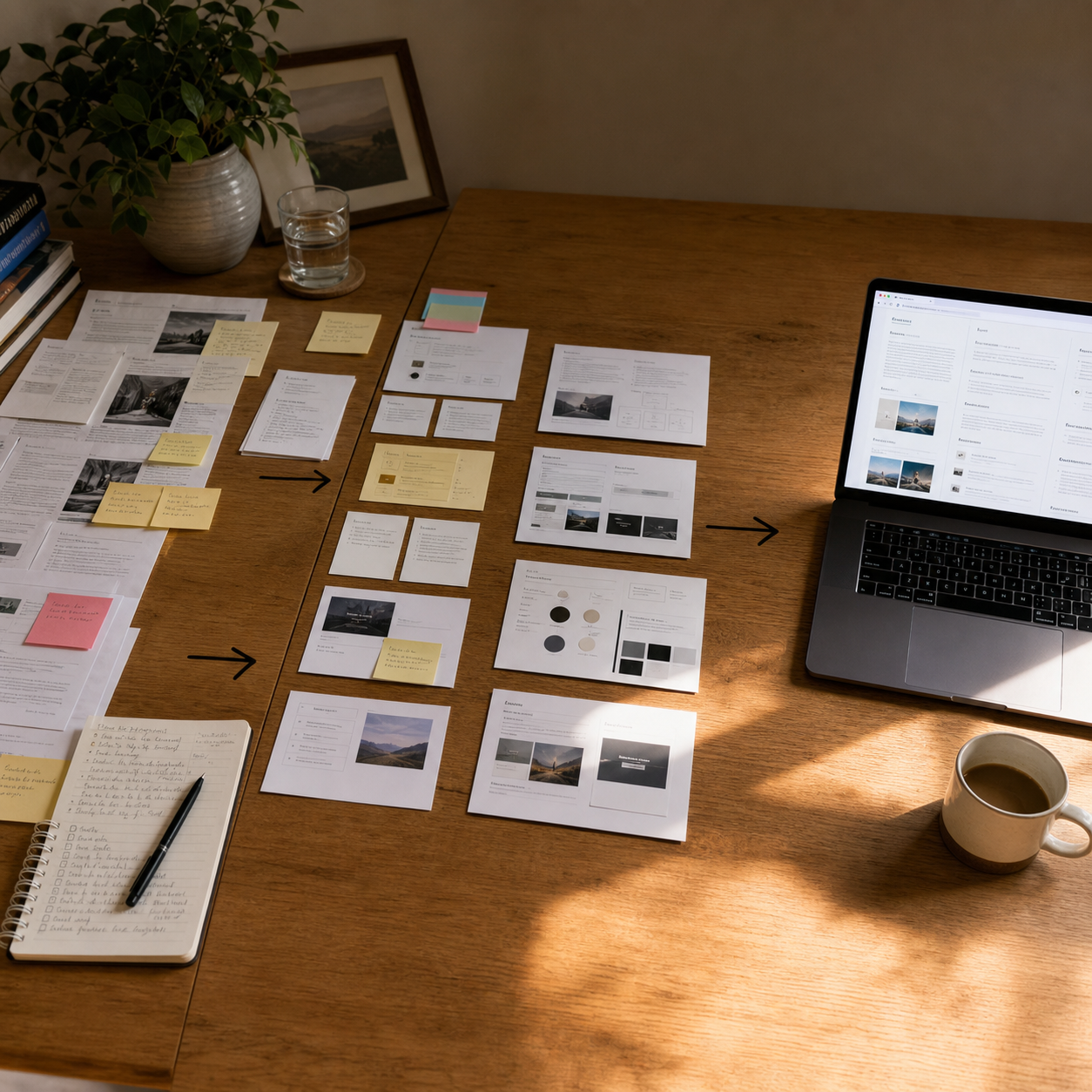
That last decision matters more than most people realize. Faces and hands are still the clearest place where AI defects show up. Unless an image genuinely needs a human, it is usually better to design around them. Object-led scenes hold together: desks, notebooks, paper, tools, gear, warm light, coffee, process artifacts.
When I picked the best scene from the five options and generated from that, the results were meaningfully different.
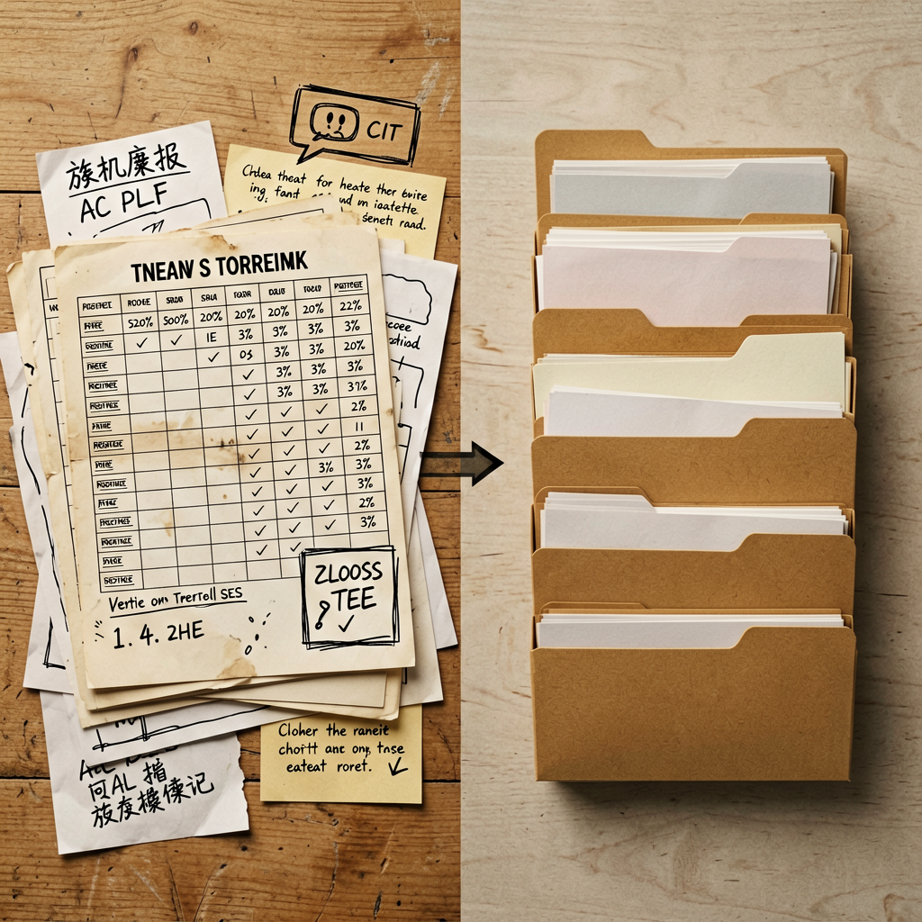
The text artifact comparison
The clearest place to see the difference is text.
The same concept, two different approaches. Direct generation produced loud, garbled text on sticky notes and screens. The scene-directed version treated text as background texture.

When text is visible but wrong, your brain catches the artifact immediately. When text is blurred and ambient, the image holds together.
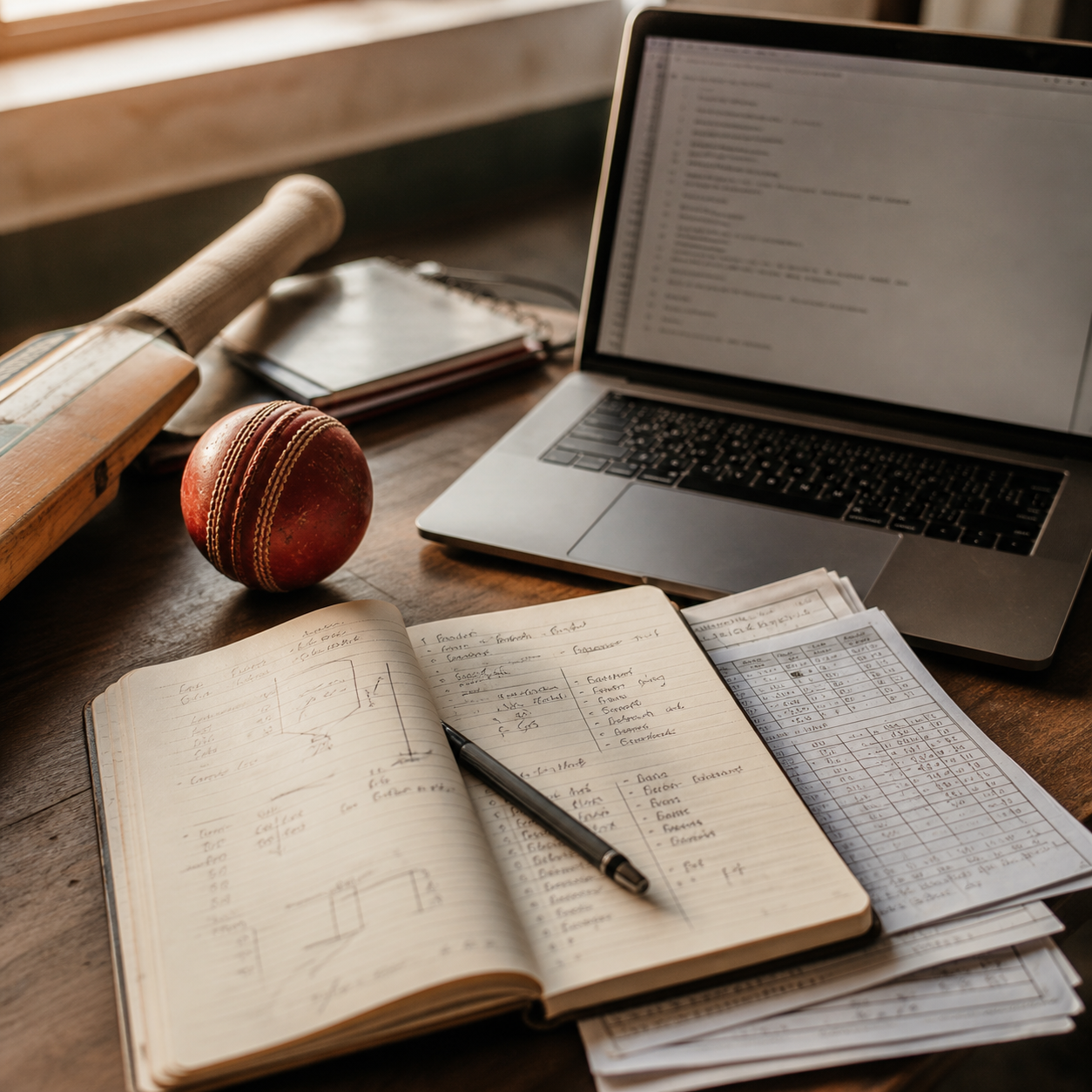
The Cricket OS example
I had been generating images for a Cricket OS concept: a shared operating system for a cricket team, pulling match data, player history, and coaching decisions into one structured layer.
The first prompt was something like “AI cricket system dashboard.”
The result looked exactly like that. Visual noise. Garbled text. Data panels designed to look futuristic. Nothing you would actually use.
When I shifted to a grounded scene brief: cricket ball, bat, notebook, laptop, warm light, working notes scattered across a table, something that looked like a real captain’s session rather than a generated UI concept, the image changed significantly.
It felt like a real moment. Not a generated poster.
What I now put in every scene brief
The five-scene approach forces you to explore multiple framings before committing to generation. Sometimes the third option is obviously better than what you would have prompted directly. Sometimes it shows you that none of the obvious angles work, which saves a dozen failed generations.
For each scene I now specify:
- Where the camera is pointed
- What the light is doing
- What stays out of frame
- Whether humans are necessary
- Whether text should be readable or just visual texture
- What mood the image should carry
When you work through those decisions, the prompt almost writes itself. You end up with a direction brief, not a keyword list.
Model behavior still shows through
This is where scene direction has limits.
AgnesAI and Codex handle text, composition, and light differently by default. Those defaults show through even when the prompt is strong.
I now explicitly include in scene briefs: “text on screens and papers should be blurred, treated as background detail, not legible.” That instruction changes the output noticeably in some models and does almost nothing in others. Which tells you something about where the defaults sit.
The bigger variable is still direction. Most prompts I see describe a topic, not a scene. That is where the obvious AI aesthetic comes from.
But model behavior is a real second variable, and worth knowing before you start.
Curious what others are doing: which image generation models are you using for production content right now, and what direction techniques help you get outputs that feel more grounded?